Friday, December 9, 2016

Jacaranda season

November in Sydney is glorious with the jacarandas in blossom. Jacarandas make a beautiful contrast with our red tiled roofs. For many seasons I have attempted to paint this but alas the season is short and life becomes accelerated towards the year end.


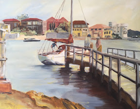
Here I revisit one of my favourite photos taken when Darling Harbour had a row of jacarandas- since replaced and probably its replacement replaced with the hectic pace of development there.

Thursday, November 3, 2016

Headlands

I've wanted to do this painting for the longest time. It is of the cliffs at North Coogee and Clovelly with the world's most scenic cemetery in the background.


I took a photo about 8 years ago and have thus far made 3 attempts. The first two I didn't like and disposed of and finally this one I'm happy with.

Friday, October 28, 2016

Richard Diebenkorn

Our inspiration this week is Diebenkorn who is more famous for his abstracts. However he did a series on figures that are pretty startling in colour.


This painting is more an exploration of colour and how it leads the eye. It's like graphic art which I have done previously. Obvious non literal use of colour. A great candid photo that was cropped to focus on the rock forms going one direction, balanced by the figures going another direction.

Still life ala Giorgio Morandi


We are doing a series based on Ochre's favourite artists. Morandi is famous for his very quiet and limited palette still life of bottles. Here's my attempt. The coffee pot is obviously a psychological outsider to the rest of the pots; intentionally so.

Thursday, October 13, 2016

Glorious summer

This is my latest painting which I do like a lot.


It's of North Coogee baths which is sadly no more as those fierce April storms have moved the rocks and altered the baths so that council had to close it for safety reasons.


But one glorious summer day I was there and the waters were so inviting and compelling that it was with great difficulty that I tore myself away.

Thursday, September 29, 2016

Great day for Yatching

This painting was done with a palette of blue and yellow, after admiring a work of Luke Sciberra's. It was surprisingly hard to not let the colours become purple.


I actually like this very much as it is much brighter than my usual landscapes. These people were loading a yatch for a party onboard. It was a gorgeous day at Parsley Bay and no doubt they would have enjoyed a great day in the harbour.

Thursday, September 8, 2016

Reworking old paintings

Did a spring clean of my canvases recently and thought some of them would benefit from a 'face lift'.


The funny thing is that one does improve over time although it's not obvious. Here I've given the beach reader a rework and finally it actually worked!


The second painting that caught my eye was the rocks at Coogee. I liked the movement from the waves but the figures were not right. I think this attempt works better.

Tuesday, August 30, 2016

Saxophonist

We are learning Ben Quilty style portraits today but portraiture is such hard work!


I cheated by choosing this jazz saxophonist as a subject. The best part is that it has all the marks like Ben but I couldn't use the palette knife well enough to attempt it.

Tuesday, August 23, 2016

Desert paintings

Deserts have always been my challenge. Their colours are so vivid as to make it unreal and yet it is difficult to conjure up a suitable palette especially since the sky is usually so dominantly blue. As Ochre is a master with colours, it makes sense to attempt a desert painting under her watch.


This first one was of Katherine Gorge which is a spectacular place in NT. I've eliminated blue altogether and used green as the complementary.


The second is of the view from Ubirr at Kakadu. In reality it is a lush green haven but this painting depicts it as at sunset when the colours are more mauve. I'm loving the Giacometti approach in drawing back into a painting.

Thursday, August 11, 2016

Spring is here

And I'm doing plein air at a park near the art school.


It's exhausting standing for hours but the results are worthwhile. Everything is much fresher and so alive plus I get to be outside.

Tuesday, August 9, 2016

Interior of my art school

Last week it was rainy and cold - brrrr and so we stayed indoors and painted our art school.


It is an old warehouse with lovely light coming from the high windows, lots is exposed beams and pipes. Ochre our tutor said that she had not seen anyone get a good picture from the front studio so I rose to the challenge and painted this.


I also had a chance to give my urbanscape the 'Giacometti' treatment and it's actually looking pretty spiffy.

Tuesday, July 26, 2016

Drawing with paint

Back to art school and today we learn of the Swiss/ Italian artist Giacometti. Giacometti was famous as a sculptor. But he also painted or rather drew with a paint brush. He would go over the lines many times in different colours. This gave his works an expressive effect.


So today we had a still life set up and had to draw it with paint brush. This is my take on it.

Thursday, June 16, 2016

Expressive Urbanscape

This week's painting is still in the orange red and blue palette but it's cooler and I've decided that it's hopeless to paint urbanscapes with an eye to accuracy. Instead I let rip - treating the painting like a drawing.


This is a view of Castlereagh St in Sydney. The original building on the right is an eyesore. It's a car park with the trains running overhead. But doesn't it look a treat in my painting?


Also the liberation I now enjoy with the colours - whoever has seen a sienna brown road?

Tuesday, June 7, 2016

Landscape from plane

On a recent work trip to Canberra, I flew over some mountains - possibly the southern highlands. The mist was rising from the valleys and it looked remarkable.


I thought to paint it but using an orange and blue palette. The real thing was covered thickly with eucalyptus forests and was verdant green but as I've a trip to Kakadu coming up I wanted to try a palette more like the red centre. Ochre guided me away from my original extremely complementary colour scheme to this subtler scheme.

Friday, June 3, 2016

Lord Howe lagoon

In March I made a trip to Lord Howe Island accompanying my friend Coralie who spent part of her early childhood there. Plenty of sketches were made and the scenery was of paradise but as for painting, not one resulted. Until now....


This is a diptych of the lagoon from somewhere between old settlement and the jetty. The corals are delightful and I spent a few hours snorkelling. It truly is a gorgeous place. Also many locals came to talk to us after they found out that Coralie's dad was the famous and well liked radio operator during the war years.

Wednesday, May 25, 2016

Still life with warm palette

In a bid to find time for myself I went to Ochre Lawson's painting class. Life gets too busy and unfortunately art is the first casualty.


Ochre's class is to paint using non-representative palettes - colours that are not what you see. I love the idea but the few times I've attempted this I've met with mixed results.
Today's palette is warm reds, oranges and yellows. I'm quite pleased with the pumpkin - does it not look delectable?
I will try to find more time for art as (a) I'm happier after art (b) surely there's more to life than working and keeping house????

Thursday, April 7, 2016

Boats

After a long time away from my easel I bought a set of paints for travelling. A trip to Lord Howe was planned and I needed to prepare. To test the palette I copied this boat scene from a book. And isn't it a great little picture? The colours and vibrant movement just catches the eye.


As for Lord Howe it was spectacular but I didn't paint as much - too busy enjoying the pristine waters and marine life. I did some sketches and now back at the studio have started a diptych. I will post this when I'm satisfied.... which hopefully will not be too long a wait

Monday, January 18, 2016

South coast

Summer is here although it alternately gets wet and chilly. I'm trying to get as much ocean swimming in as possible - between the rain and resulting pollution I'm not having much luck!


If I can't swim I can paint the beach. This one is in the south coast - where the beaches are both rocky and sandy. It's a magical part of the world.

Saturday, January 9, 2016

Gordon's bay

Our Sydney coast is really very special with the sandstone cliffs awashed by the sea. Gordon's Bay is between Coogee and Clovelly - part of the great Bondi walk.


Here I have used palette knife techniques to render the cliff and waves. There's something exhilarating about standing on the edge looking at the pounding surf.