Friday, October 28, 2016

Richard Diebenkorn

Our inspiration this week is Diebenkorn who is more famous for his abstracts. However he did a series on figures that are pretty startling in colour.


This painting is more an exploration of colour and how it leads the eye. It's like graphic art which I have done previously. Obvious non literal use of colour. A great candid photo that was cropped to focus on the rock forms going one direction, balanced by the figures going another direction.

Still life ala Giorgio Morandi


We are doing a series based on Ochre's favourite artists. Morandi is famous for his very quiet and limited palette still life of bottles. Here's my attempt. The coffee pot is obviously a psychological outsider to the rest of the pots; intentionally so.

Thursday, October 13, 2016

Glorious summer

This is my latest painting which I do like a lot.


It's of North Coogee baths which is sadly no more as those fierce April storms have moved the rocks and altered the baths so that council had to close it for safety reasons.


But one glorious summer day I was there and the waters were so inviting and compelling that it was with great difficulty that I tore myself away.

Thursday, September 29, 2016

Great day for Yatching

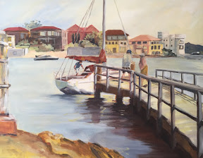
This painting was done with a palette of blue and yellow, after admiring a work of Luke Sciberra's. It was surprisingly hard to not let the colours become purple.


I actually like this very much as it is much brighter than my usual landscapes. These people were loading a yatch for a party onboard. It was a gorgeous day at Parsley Bay and no doubt they would have enjoyed a great day in the harbour.

Thursday, September 8, 2016

Reworking old paintings

Did a spring clean of my canvases recently and thought some of them would benefit from a 'face lift'.


The funny thing is that one does improve over time although it's not obvious. Here I've given the beach reader a rework and finally it actually worked!


The second painting that caught my eye was the rocks at Coogee. I liked the movement from the waves but the figures were not right. I think this attempt works better.

Tuesday, August 30, 2016

Saxophonist

We are learning Ben Quilty style portraits today but portraiture is such hard work!


I cheated by choosing this jazz saxophonist as a subject. The best part is that it has all the marks like Ben but I couldn't use the palette knife well enough to attempt it.

Tuesday, August 23, 2016

Desert paintings

Deserts have always been my challenge. Their colours are so vivid as to make it unreal and yet it is difficult to conjure up a suitable palette especially since the sky is usually so dominantly blue. As Ochre is a master with colours, it makes sense to attempt a desert painting under her watch.


This first one was of Katherine Gorge which is a spectacular place in NT. I've eliminated blue altogether and used green as the complementary.


The second is of the view from Ubirr at Kakadu. In reality it is a lush green haven but this painting depicts it as at sunset when the colours are more mauve. I'm loving the Giacometti approach in drawing back into a painting.